Button Variants
While working on projects, I often found that slight variations in button styles disrupted overall design consistency. To address this, I started an experiment to create reusable button components.
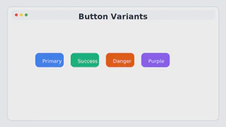
Using TailwindCSS’s @apply, I explored how to combine base styles, sizes, and state changes into a single component class. Based on this, I created several button “variants” such as Primary, Success, and Danger to suit different use cases.
I focused especially on providing consistent visual feedback for various states like hover, focus, and active. I also standardized details such as shadows and border-radius so that any button could fit seamlessly within the design system.
This experiment went beyond simple styling — it was about exploring how to manage UI components systematically and improve reusability. I believe this will serve as a solid foundation to accelerate development in future projects.