Dashboard Card
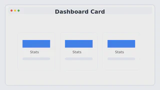
When building dashboards that present data at a glance, I believe the most essential element is the “card” component. So I conducted a small experiment to create a clean, versatile card UI that fits well in any context.
Since simple borders alone couldn’t convey enough depth, I explored how to combine Tailwind’s shadow and ring utilities to achieve the cleanest, most balanced look. I also experimented with subtle hover effects—where the shadow and border color shift softly—to give users a sense of focus and interactivity.
Inside each card, I adjusted font size and weight to make the key metric stand out clearly, seeking the optimal visual hierarchy. Through this experiment, I was able to explore the small UI design details that naturally guide the user’s attention and improve data readability.